Originally posted: September 7, 2016
I have to create an infographic! I’ve never created an infographic! To get myself familiar with this form of information conveyance I took a critical look at a few of them to get my bearings. I have had to look at some principles of design, namely CARP principles. These principles are described in the infographic below.
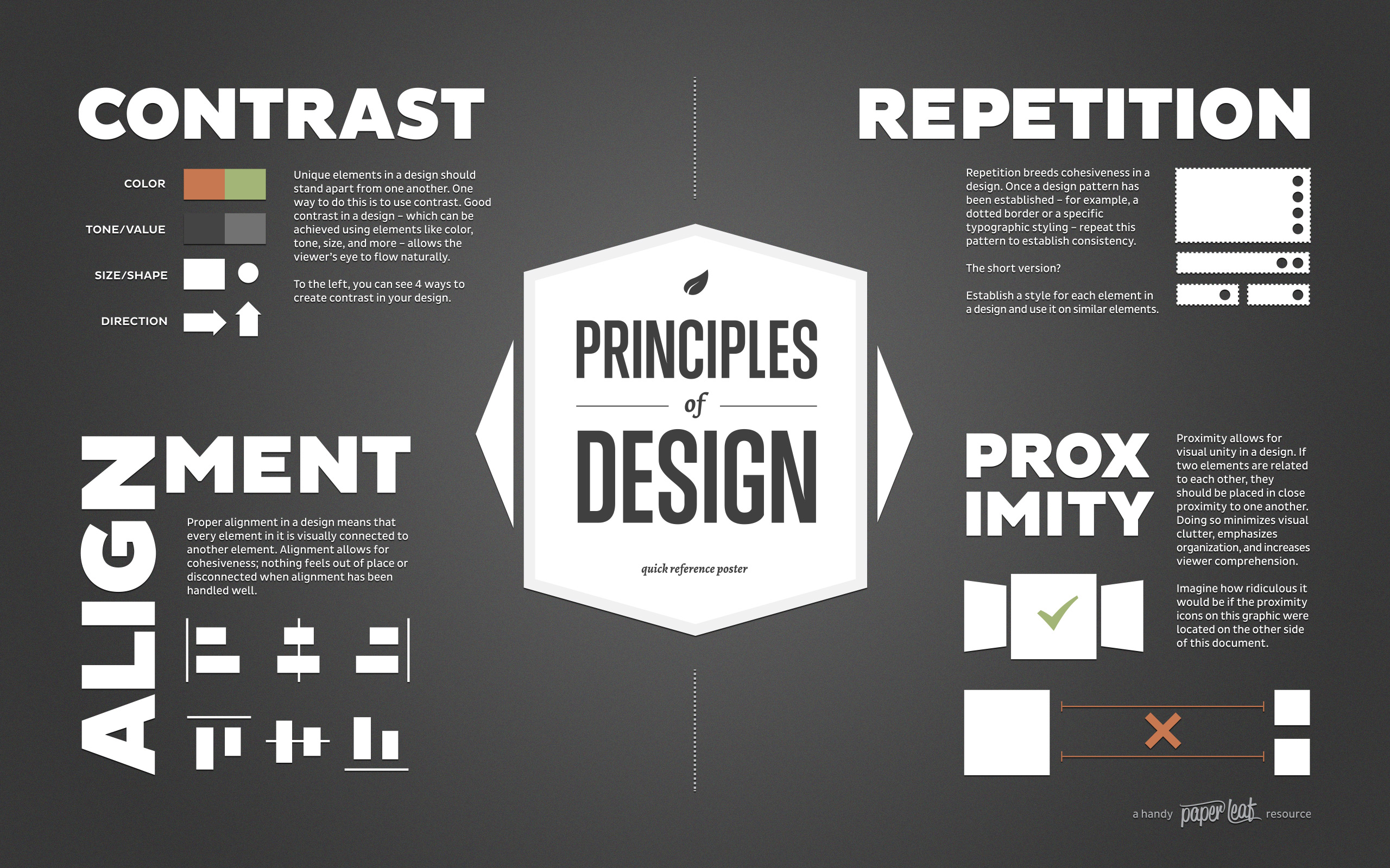
Principles of Design
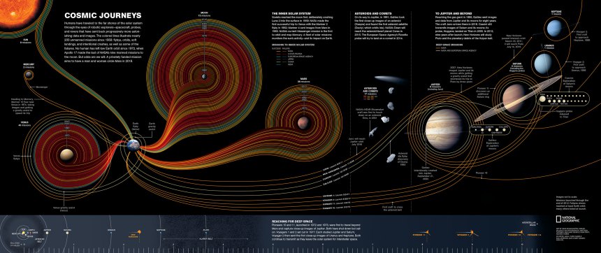
These principles should be kept in mind when designing in general not just when designing an infographic. Infographics are an interesting way to communicate information, especially boring data sets that are usually made into graphs. Yawn. The following infographic shows our Cosmic Journeys as we wade ever farther into the dark matter of space.
Contrast:
The text albeit small is easy to read against the black background. The meaning of the graphical elements depicting the various space missions is clear. Everything is color coded to show which country’s mission is shown and whether it was a success or failure.
Repetition:
The stylistic elements, text headings and body text of the infographic are consistent. There are some relevant facts scattered across the image. When I saw one, I looked for others.
Alignment:
The graphic consists of three segments each with their own heading and textual information. The alignment of the text across the graphic draws the eye to the corresponding information. The graphical elements are aligned along a sweeping pattern across the graphic allowing the viewer to follow the mission lines from their point of origin. The data is arranged in such a way that it doesn’t matter which direction you read the graphic.
Proximity:
Text information is place near its graphical representation. As trippy as the image may seem, it is easily readable and the information is communicated clearly.
Overall I think the infographic does a good job at illustrating the relative scale of our activity in the solar system. I enjoy these visual representations of data. This image is way cooler than a graph of the same information.